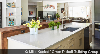
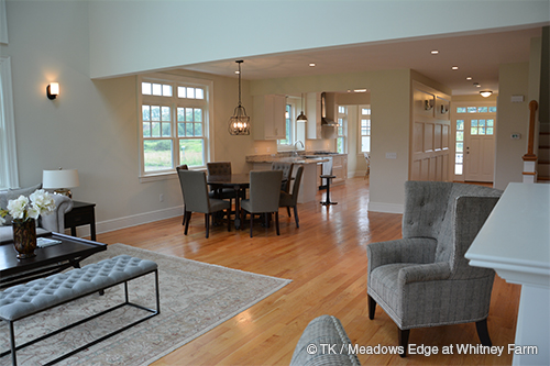
It’s no secret that builders, developers, and architects have favored open-plan layouts in the past decade or two. Bigger kitchens that spill out into family and dining rooms are the new norm, and the aesthetics and healthfulness of outdoor living space often extends inward, thanks to seamless glass doors and floor-to-ceiling windows.
The shift toward openness is due to several factors. Technological advancements in construction permit longer open spans as steel has replaced wood in supporting headers or beams, says Orren Pickell, whose eponymous building firm is located outside Chicago. Also, he notes that an open plan adds a feeling of greater square footage without having to actually add physical space to a home’s footprint.
Sandy Owens, CRS, with RE/MAX Commonwealth in Midlothian, Va., credits a cultural move toward less formal living and entertainment spaces as a reason for the popularity of the open plan. In casual, multipurpose rooms, larger TV screens can be mounted and visible from several vantage points inside the room and out, says Connecticut architect Duo Dickinson, author of Staying Put: Remodel your House to Get the Home You Want (Taunton Press). Newer audio equipment has also enabled sound to be heard throughout larger spaces.
However, after years of clamoring for more open-plan layouts that resemble cool artists’ lofts, the pendulum seems to be settling in the middle with a desire for both striking airiness and cozy corners. Owens says many homeowners who have actually experienced living in reverberant, fishbowl-type spaces find that level of transparency doesn’t always work well. They often want at least one quiet nook or separate room that’s designated tech-free, what “we used to call the living room,” says designer Susan Brunstrum, owner of Sweet Peas Design in Chicago. And Pickell notes that many may feel stressed out by being able to see their messy kitchen from every room on the main floor.
But adding or subtracting walls can be expensive in existing homes. Dickinson notes that putting up full or partial walls is usually less costly than taking one down, but the cost increases if the wall incorporates HVAC ducts, electrical wiring, or plumbing. And while a partial wall may seem like an easy compromise, they generally require support at each end. Removing all or part of a load-bearing wall can cost three times as much as removing a partition (a wall that carries no weight), says Dickinson. “But beware,” he adds, “since even walls that don’t support roofs or floors above may carry ceiling framing, so costs need to be scoped out before demo begins.” If a header—the horizontal beam that is inserted overhead to support a big span when walls are removed—is required, the cost may run to $20,000, depending on length. Homeowners also should keep in mind ancillary costs, such as laying and patching flooring, that comes with such projects.
As real estate pros know, it’s almost impossible for a listing’s layout to work for everyone. Your clients will need to decide how much openness they want and whether they want to be able to reconfigure space again as their needs or tastes change. These ideas for opening up closed spaces and separating layouts that are too open range in complexity, price, and permanence, but they’ll give you a solid ground from which to help buyers and sellers decide on a space that can work for them.
Strategies to Close Up Wide-Open Space
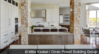
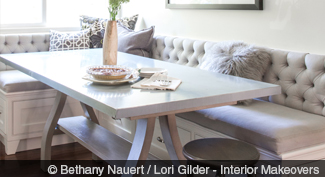
- Build in an architectural feature. If construction seems like the best solution, homeowners can consider building a bookcase, banquette, fireplace, soffit, glass door, or column into the home instead of a wall. In one project, Pickell repeated stone used on the exterior of a house in columns in a kitchen. It extends from the counter to the ceiling, setting off the area without obstructing views. Other strategies he’s used to make an area more intimate include lowering ceilings; installing beams, coves, or coffers; and adding an interior glass door that keeps the line of sight open between areas but still dampens sound. Los Angeles designer Lori Gilder, owner of Interior Makeovers, often suggests banquettes to section off an eating space, rather than adding a table and chairs, which tend to float in the middle of a room.
 Dickinson notes that newer gas or gel capsule fireplaces are easy to vent and don’t require a chimney, making them simpler to place and less costly to install than with traditional log-burning fireplaces of years past.
- Differentiate areas with flooring, paint, and wallpaper. Changes in material, color, or texture on a floor, wall, or ceiling are more visual than structural but still can fool the eye into thinking there’s separation. Deep intense hues that some manufacturers are debuting as their 2018 Colors of the Year—Sherwin-Williams’ rich oceanside blue and Benjamin Moore’s deep barn-red caliente—help make rooms feel smaller and more nurturing. Certain dark wallpapers and paneling have a similar effect. The upside is that these choices can be changed fairly easily to reopen space; the downside is that they won’t deflect noise as well as structural changes.
- Use furniture to create vignettes. This also doesn’t involve a permanent, structural redo, just positioning existing furniture to suggest a distinct room within a larger space. Simply pulling sofas, chairs, and tables away from walls and setting them atop an area rug can accomplish the intended effect. An edgier option could include floating curtains from the ceiling rather than at windows and doors.
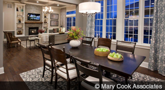
- Use light effectively. Lighting can make a big difference in how open or closed rooms appear. With the advanced controls LEDs and smart fixtures offer, homeowners can adjust bulb color and temperature (lower and warmer light conveys small, intimate space, while cooler and brighter lights accomplish the opposite). Recessed lights are a more permanent, costly option but new longer-lasting, energy-efficient LEDs help keep costs down in the long run.
Methods for Opening Up Separated Rooms
- Remove doors, walls, and cabinetry. An easy, affordable solution—even for DIYers—is to remove doors and jambs, then patch and paint so there’s a clear view between adjoining rooms, says Maria Elena Holguin with Robb & Stucky Interiors (though homeowners should save the doors for future buyers who may want them restored to their former location).
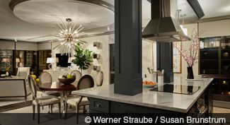
- Raise the ceiling. Raising a roof is “crazy expensive—starting at $50,000 and up from there,” says Dickinson. A more affordable approach to add height and openness is to raise angled ceilings when there’s a pitched roof. This option can range from between $3,000 and $6,000, Dickinson says. However, he cautions that adding insulation, lighting, and HVAC can double that cost. “You’ll need an experienced builder or architect. For larger projects, these professionals would bring in an engineer,” Dickinson says. Before any major change is done, your clients should consider having a plan drawn to visualize the possibilities and drawbacks.
- Install skylights or add windows. Less involved, these treatments can still make a room feel larger and more open. But the price can add up quickly. Nathan Kipnis, principal of Kipnis Architecture + Planning in Evanston, Ill., suggests three, five, or six windows, depending upon the room. “One will bring in light and ventilation, but won’t open up the space sufficiently,” he says. Kipnis likes to group several windows in a grid, and perhaps adding a transom above. A project like this may run clients anywhere from $3,000 to $6,000 just for the windows, plus several thousand more for the structure around them. But even just two windows can run far higher. Oldenburg reported a recent project where just two windows cost around $20,000, mostly due to the need to punch openings out of a brick facade. Skylights themselves may run between $1,000 and $1,500 each, according to Kipnis, but the ancillary costs vary there too. “If you need to rework the structure, then it will add $5,000 to $10,000,” he says.
- Blur room lines with furniture groupings and design choices. Separate rooms can feel more like one entity if lines are intentionally blurred between them. The trick is to use floor materials, wall colors, and even furniture groupings to bridge the spaces, says Mary Cook, principal of Mary Cook Associates, a national commercial interior design firm based in Chicago. Be sure to use furniture that’s finished on all sides since it’ll be viewed from all around, advises Kipnis.
- Use mirrors. Reflective surfaces that extend vertically up to ceilings and horizontally along entire walls have an effect of opening up space and allowing light to bounce around more freely, says Dickinson. Even using mirrors along smaller expanses—say on bookshelves or backsplashes—can help.
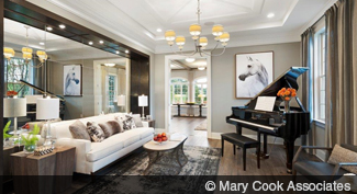
- Go light and repeat. One of the reasons white remains one of the most popular colors in design is that it opens up space more than deep intense hues and woods do. And today there are literally hundreds of white and off-white paint shades to consider, as well as light beiges and grays. Repeating the same wall, ceiling, and trim color offers an even more effective approach.
